|
Croker-Rhyne Co., Inc. |
|
Main Page |
Philosophy | Current
Recommendations |
Newsletter Archives Contact Us
|
|
|
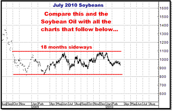
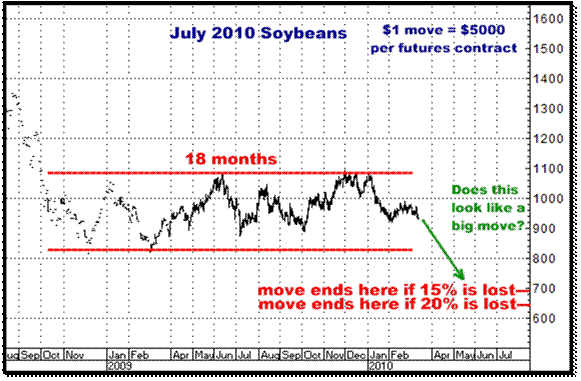
Chart Overkill Almost 20 years ago, in my ever ongoing search for “what is the best trade you can make?”, I concluded there was one market setup I overwhelmingly believe gives you the greatest probability of making money in the futures markets. While there are innumerable approaches one can take with the markets, that trade is best described by the following excerpts from our website: Futures are inherently volatile...and what we are really trading is volatility. All the markets will have periods of sideways action, but all of the markets are frequently trying to move up, or down. Your objective is to be going with them when they are really going somewhere. Futures are highly leveraged. (usually about 5%). Get on the right side of something which is truly moving and high percentage gains can be a function of that leverage. It goes without saying that same leverage can also lead to high percentage losses. Buying Futures Options allows you to be on both sides of the market at the same time. Just what it says. You can buy options in both directions and whichever way the market goes (if it does move), one side will generally benefit from it, one side will not. Of course, if it doesn't move, neither side will benefit, and you will probably lose money. AND THE FOLLOWING EXCERPT IS THE PRIMARY SUBJECT OF THIS NEWSLETTER… Select markets which have done nothing for a long time. If a market has been trading sideways for quite some time, probabilities "should be" (anything is possible in the futures markets) better it is soon going to move somewhere. Long sideways moves are often followed by large, fast one directional moves. That last statement did not just come out of thin air…The observation I first made back in 1991 (when I left Merrill Lynch) was that the greatest leverage and the highest possibility of catching a truly sizeable, fairly rapid move was available in markets that HAD BEEN trading in a sideways range for an extended period of time…I also observed that while these same sideways ranges could result in major up, OR down, moves, those moves that happened to the downside tended to be, in my opinion, where you more frequently witnessed the biggest, fastest price changes… And without any doubt whatsoever, this is precisely what I perceive to be the case today in the entire Soybean complex following the last 18 months of “doing nothing”, trading dead sideways, seemingly forever. I continue to see being short the soybean complex as having imminent and major profit potential. Here is a further look at the Soybean and Soybean Oil charts that I have posted SO many times in the last year…Following these two charts you will find some historical examples of charts from the past 20 years (all sideways ranges that broke to the downside) that you will easily recognize as being fairly identical to what we are seeing in the soybean complex today… As you look through these charts, I am sure you will see the obvious similarities between all of them and what Soybeans and Soybean Oil look like today. I should also note that just because all of these examples resolved themselves by trading sharply lower does not automatically mean the same will happen with the soybean complex. Putting it another way, every sideways range does not end by going south. Sometimes they end by taking off on the upside…BUT they Do all finally go one way or the other. The truth is, there are 12 historical charts here but I actually have 35 examples of these sideways ranges, all of which I have posted on the website and can be accessed by clicking on the following link: http://www.crokerrhyne.com/newsletters/03-12-10.htm If the link does not work, go to our crokerrhyne.com website and you will find it in the Newsletter Archives as “March 12, 2010, Historical Study, Sideways Ranges that traded lower”. So here is the present…
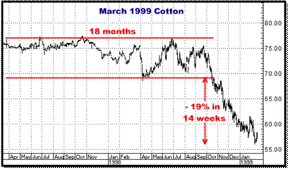
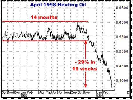
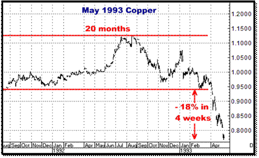
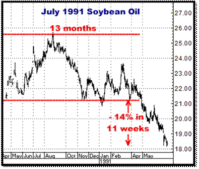
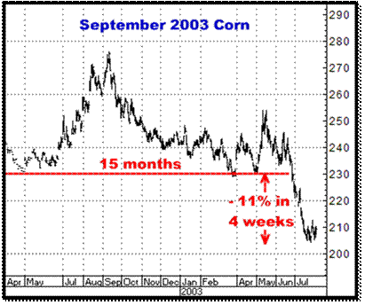
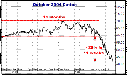
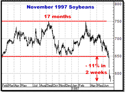
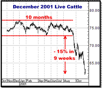
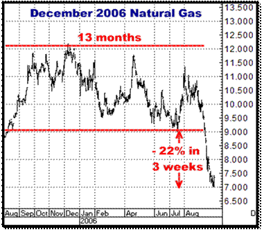
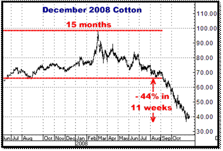
Here are examples of long sideways ranges that ended by falling quite sharply. I have noted how long each market was consolidating sideways and then the size and timeframe of the sell off that followed. There are 12 examples here. If you want to see more (35 total), the following link will take you to them on our website. Believe me, they are all well worth a look… http://www.crokerrhyne.com/newsletters/03-12-10.htm Just to be sure my labeling of all these charts makes sense…In this first chart, March 1999 Cotton, the market basically “did nothing” for 18 months, then finally fell through its lows and lost 19% of its value (from its old low) in 14 week’s time.
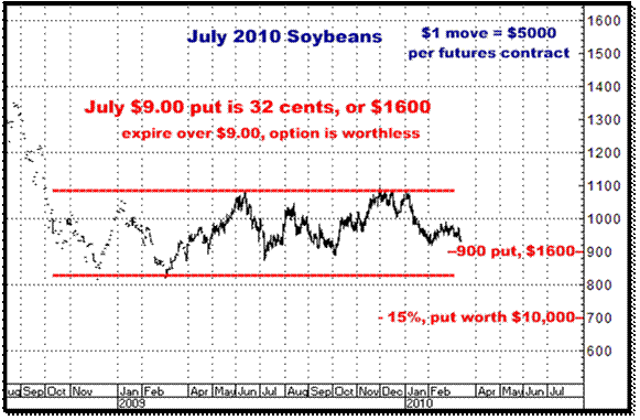
Again, if you want to see about 3 times this many historical examples (you should do this), the following link will take you to them on our website: http://www.crokerrhyne.com/newsletters/03-12-10.htm OK…Here is the July 2010 Soybean chart again…See any similarities?
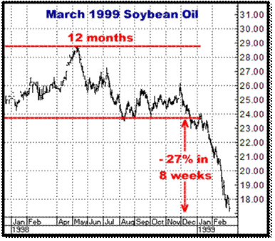
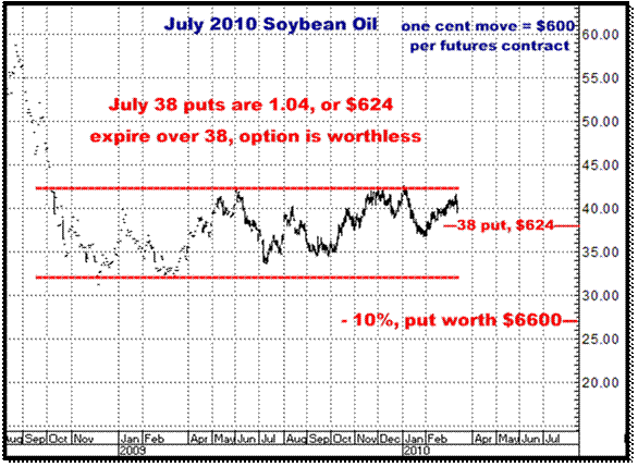
And where the Soybeans go, so will the Soybean Oil…Of late, on the back a lot of press regarding Biodiesel, I believe Soybean Oil has been pumped full of a lot of speculative air, and consequently is quite far off its recent lows. I fully expect to see those lows blown away and still look for this market to trade quite rapidly into the mid 20’s. So here’s the July Soybean Oil chart again…With the world producing a record crop (and estimates seem to be growing month by month), and considering the fact we are still at extremely high historical levels, if my harebrained analysis is at all correct, I am supposing we will see AT LEAST a 15% break (from the old lows).
And here is a Soybean Oil put option that I think make sense…
As I put together these newsletters, some of which take two to three days to actually finish, I am always making notes as thoughts come to mind regarding whatever it is I am investigating. Some of those thoughts make it into the letter, but many, usually in the interest of brevity, get discarded. At the moment, I’m really ready to call it quits on this one, but I’ve got the usual pile of paper scraps with excess ideas I thought it important to express, and for whatever reason, am just going to end this project by throwing them in…And this has truly been a “project” in that I essentially reviewed EVERY major commodity chart there is for the past 20 years, then aside from whatever text I did create here, had to construct 40 odd charts to hopefully show you what I see, and why I see it that way…Anyway, this newsletter probably took a little more labor than the norm, so I guess I have more extra notes sitting here and…what the hell…Here they are…unedited, some of them only partially developed ideas. Unedited Notes I’ve been around this for a long time. I’m a fairly smart, extremely experienced, hard working guy with decent instincts about what makes sense and what doesn’t, but this still doesn’t mean I ever know what is going to happen, or when it’s going to happen, in any market. Sometimes I’m early, sometimes I’m just wrong but I really cannot count the times when whatever market you want to name just suddenly started moving…I mean, out of the seeming blue, just really started cracking, big and fast… The soybean complex has been in one of those sideways ranges for 18 months now. I am still short and still believe this is going to end up being a monster trade. I’ll offer these 35 historical examples of similarly long sideways ranges, in a variety of markets, and how they resulted in a “large, fast one directional move”, and in all these cases, to the downside. These examples were not selected at random, and to be sure, I am obviously not inferring that you can expect a bearish move just because a market has been sideways. At any rate, I think that the soybean complex will soon be doing some version of what you will see here over, and over and over…. To begin with, as one of the prerequisites to having this trade “set up” IS a long sideways move, usually a minimum of 8 to 12 months, so this particular trade only comes up occasionally…maybe, out of all the markets, only two or three times a year…or less. Why the markets suddenly start to move I’ll never know. But I just know, from evidence, they DO. Why it’s today or next week or next month, I’ll never know…You just have to stay on board and wait it out…and be there when it starts. I am not implying it has to be like any of these charts…just that I believe the percentages are in your favor…I don’t care what level prices are at, high or low, you can have a 30% drop at low prices just as easily as when they are high. My approach is to show you what I see…no mumbo jumbo…no professions that I KNOW what’s going to happen…I present my opinion, which is never based on just haphazard guesses (although it seems that way sometimes). Ranges do occur. You have to be on board and ready to go for more with them when they end…and start REALLY moving. One of the real life dynamics when a market is falling out of a range is that actual buyers of that commodity find something else to do today…Sellers, on the other hand, become more and more anxious, and more active as sellers as prices fall away from old levels at which they were able to sell their product…They can then hang out only so long wishing they’d “sold it when it was up”, or when it was just sitting there for MONTHS, before they HAVE to get it sold…Basically you have buyers who find it easier to wait and sellers who get panicky…All anxious sellers and extremely unhurried buyers makes for the straight down sort of action you find on many of these examples. Every one of these is not a nice clean move…but much lower, generally, is where they end up…This doesn’t happen every day or every month...It takes time for this trade to develop but it is an ever present part of the markets. Doesn’t matter what particular market. This sort of trade does happen over and over…You just have to recognize it when it is there. Lots of work here. Please pass it along to someone who might be interested… Markets ALWAYS go a hell of a lot further than anybody ever expects…In the back of my mind, I still think it is quite possible we WILL see Soybeans in the very low 6’s and Soybean Oil in the low 20’s. Short is the “best” side of the markets…Moves do tend to be faster and bigger (my observation) as the dynamics of what is happening are different in up and down markets. Most people prefer to be buyers. Fear is often the primary driver in a bear move. The best indicator of direction I know is either new highs or new lows out of a long term consolidation. This is all about picking your spots, going with the percentages…being there when something big happens…A 10% move in any commodity can mean a lot of money if you own the right options. The Chinese, having been big buyers, have just cancelled some soybean orders…? I’ve seen this before and it’s sometimes like the first crack in the dam… Seems like you have to wait and wait… and wait for a move to start…but then out of nowhere, it just does…Seems like it’s never due to any particular widely recognized event…I’ve been surprised, pleasantly and otherwise, a 1000 times. I make maybe 4 or 5 trades a year…It’s not my style to be all over the place, chasing the latest hot idea… What I like to see is a market taking out significant previous lows, sometimes many times established. I wish I could have seen this sideways move coming…We definitely could have saved a ton of money…but what do we have now? A bigger, better, I believe, higher leveraged and bigger potential trade. It’s HARD to do, but I really do try to see this as a brand new situation, to not think about what I’ve lost…and be just as aggressive today as I was 9 months or a year ago. AND FINALLY…I told you I had a lot of notes. Aren’t you glad I didn’t spend 20 pages expanding on all of that? Bottom line…I think the Beans ARE just sitting on the edge of the cliff. I DO think they are about to…yes, FINALLY, unaccompanied by any specific news…begin to be blown out of the water. If you haven’t been on this, you’ve saved a lot of money. If you have been, it’s been costly…But whatever the case, I am totally convinced that any bucks you put on the table now really could end up getting you 5-10 times what you spend…As always, it would be unethical of me to not remind you that if I am wrong, you could also lose every dime you invest. Give me a call if you are interested… Thanks, |
|